Tell us a little bit about yourself—your background, major program of study, reasons for taking this trip, and anything else interesting you want to share (maybe something people might not know about you).
My name is Eric Berg and I am in between the second and third years of the Bachelors of Fine Arts program at Kwantlen Polytechnic University. I am exploring working in a variety of media while doing my degree including painting, sculpture, photography, film, and installation work. I am interested in art being produced now and the workings of the art world as well as the role of art amongst a wider more general audience. This trip is a chance to see current work from transplants trying to make a go of it in the still important hub of New York and more established artists representing their countries at the Venice Biennale, as well as famous paintings that are now part of the art school curriculum. In other words, an overview of the range of art happening currently. Besides the opportunity to see art in person, I have long wanted to visit New York because it is the source of much work that has been important to me. Music, movies, novels — most with some kind of punk / independent / artsy / critical attitude — form my ideas of the city. As a bonus, being on the East Coast means I will be able to try a bunch of craft beer that isn’t available at home!
What has met or exceeded your expectations or surprised you about New York so far?

Eric was assigned Vito Acconci's video art work Theme Song (1973).
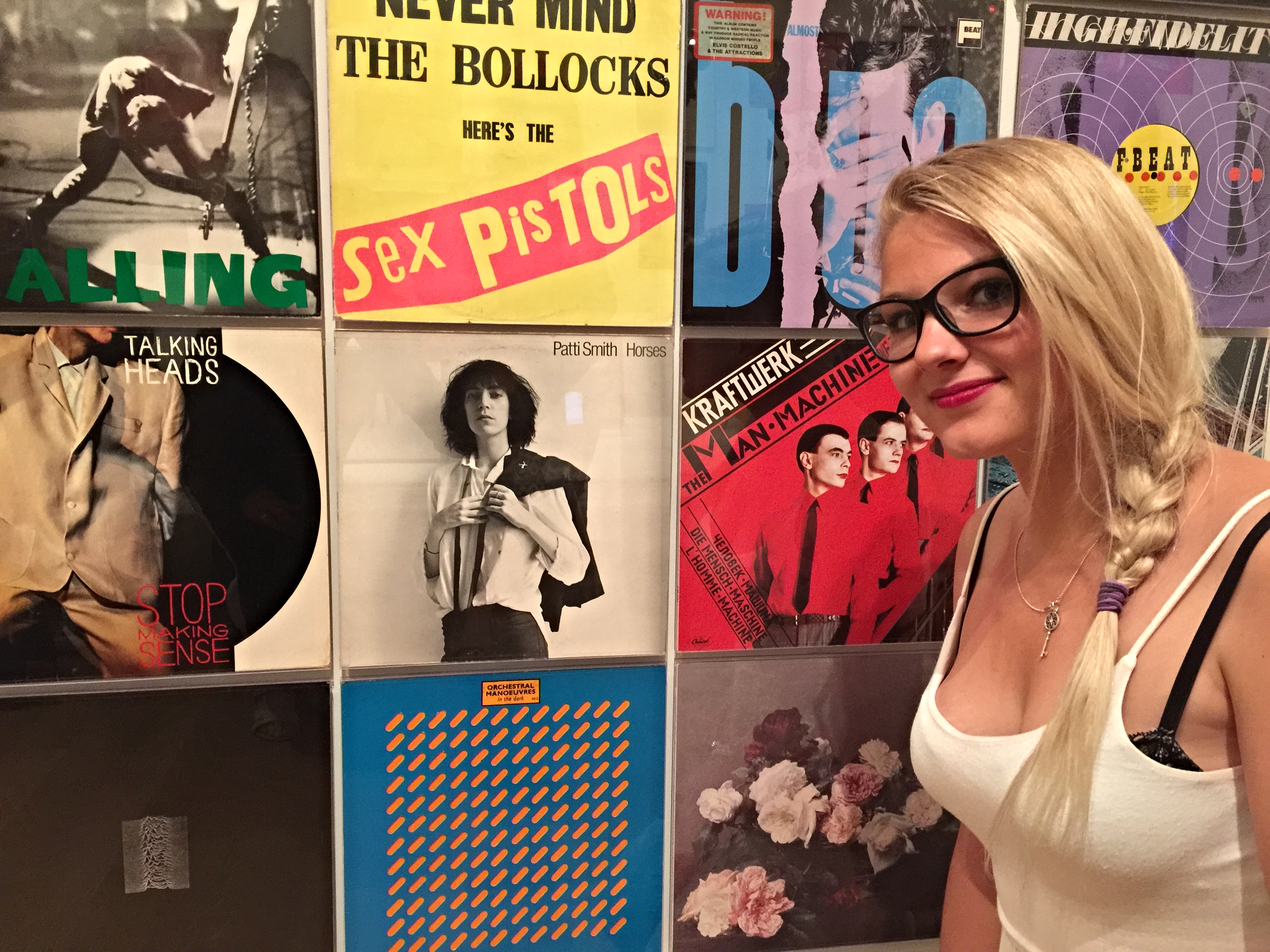
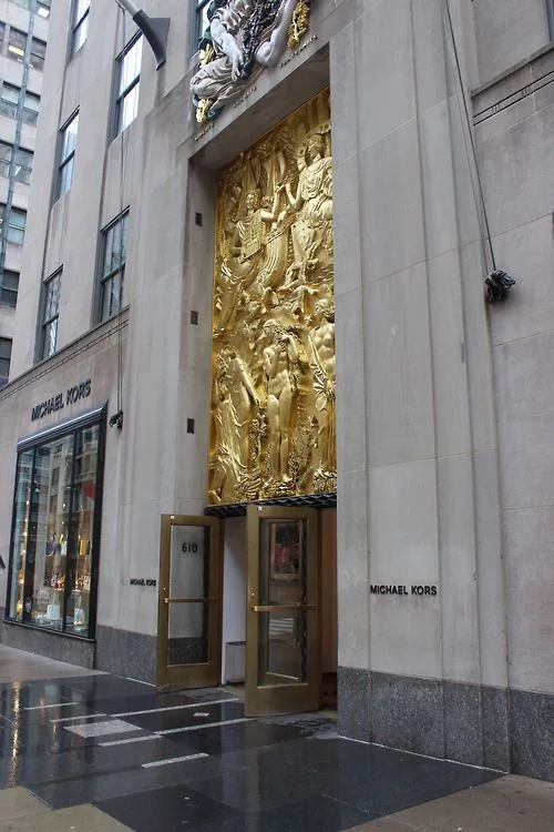
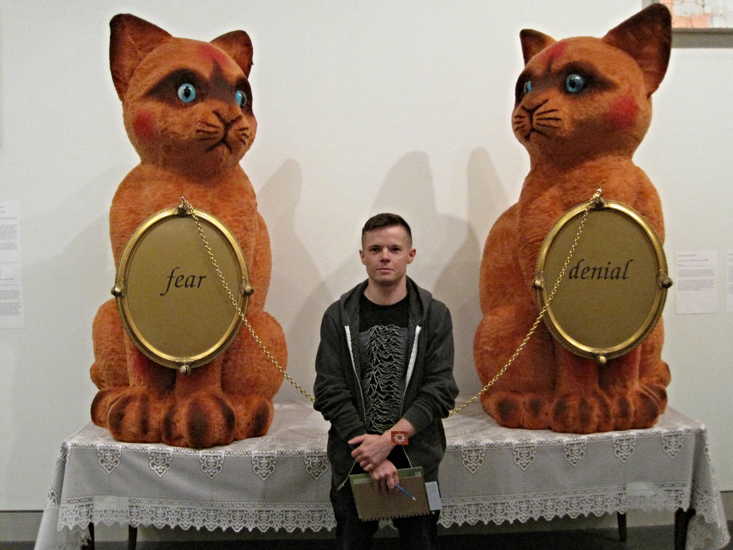
I really like New York, it is a modern metropolis, the largest newer city I have ever been to; there is a lot going on all the time. I like the way the city looks, there are many beautiful buildings in a pleasing mix of styles, heights, and age. New York has a reputation of being crazily fast-paced and mean, but I find people are friendly. Different areas have different feelings as well, and it is possible to find calm quiet space. I like that New Yorkers seem to have a sense of ownership and engagement with their city; they make things happen. Things can be makeshift, which means not everything looks uniform and clean and manufactured, and I prefer it that way. I also like that we are staying in a neighbourhood with a lot of independent businesses and people doing their own thing. There is so much to see and do; I didn't even get to some of the larger museums, let alone make a dent in visiting smaller galleries in any of the various neighbourhoods. I’m not sure whether I could live here (I wouldn’t mind trying it though!), and I want to return. I feel very comfortable and enjoy NYC a lot.
Give us some insight into your assigned artwork from the Museum of Modern Art. Who is the artist? When was this work made? What is the content of this work? In what context and as part of what art movement was it made?
My assigned artwork was a 1973 video piece called Theme Song by Vito Acconci. Acconci is a New York artist who worked in video and performance during the 1960s and 70s, making work that was confrontational and critiqued social norms. In the 33 min, fixed camera, single take Theme Song, Acconci lies on the floor and addresses a “you” through the camera, running through stock interactions with an other who isn’t there. While smoking and listening to — and singing along with — music of the time, the artist invites and pleads, offers sympathy and understanding, attempts to seduce, positions physical intimacy as a pragmatic exchange, and later apologizes and laments his mistakes within this fictional relationship. Video technology was first used in the 1960s by artists as it became available on a smaller scale, offering a way to engage and address audiences in a medium akin to the predominantly commercial format of television. Acconci was part of the 1970s East Village scene in Manhattan which included work of all kinds and styles and was united by its experimentalism, its focus on audience engagement and participation, and the idea of art as a process and practice. Overall, the movement was a response and reaction against the dominant artworks of the time — large Modern paintings created by “genius artists”.
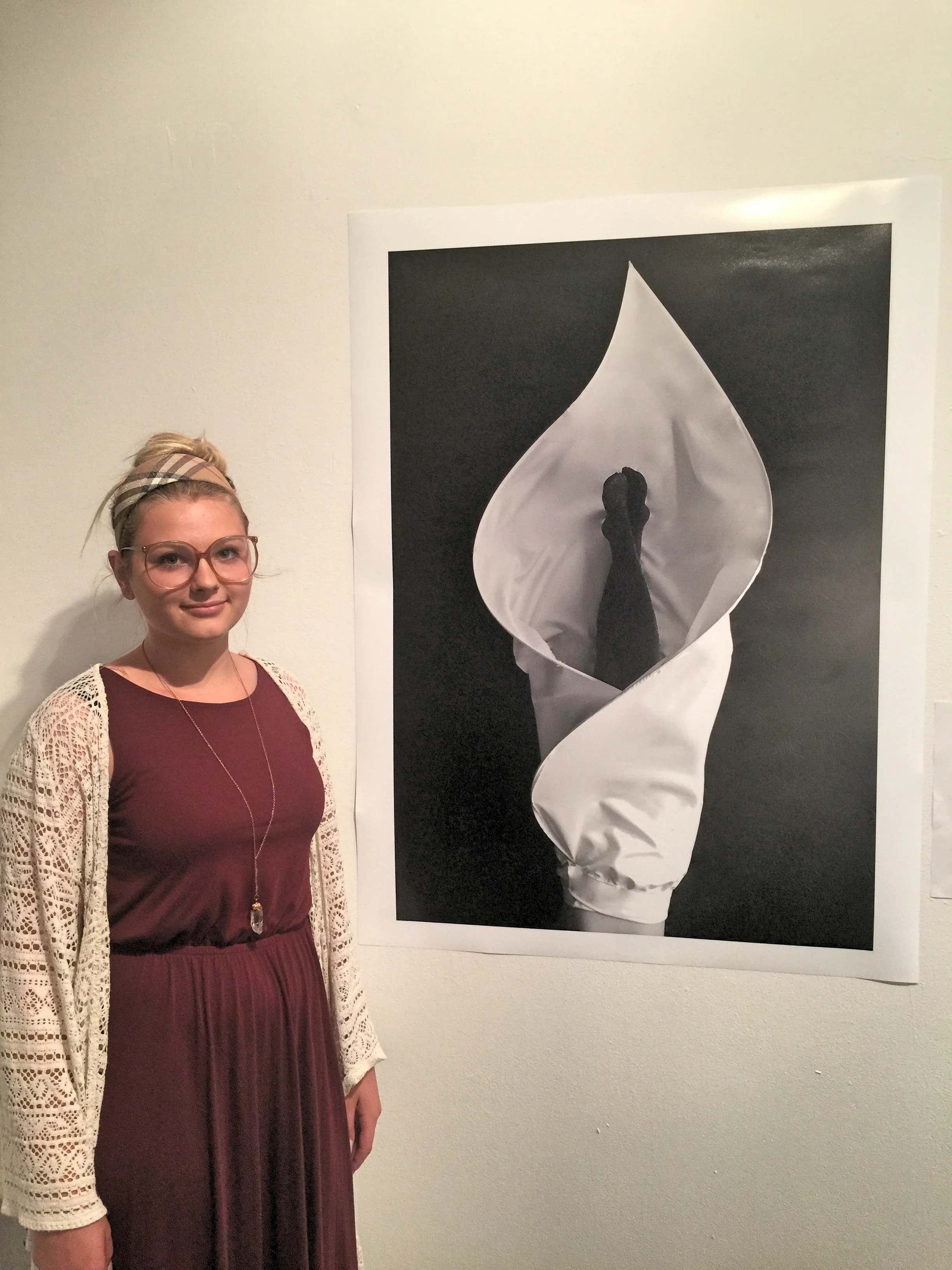
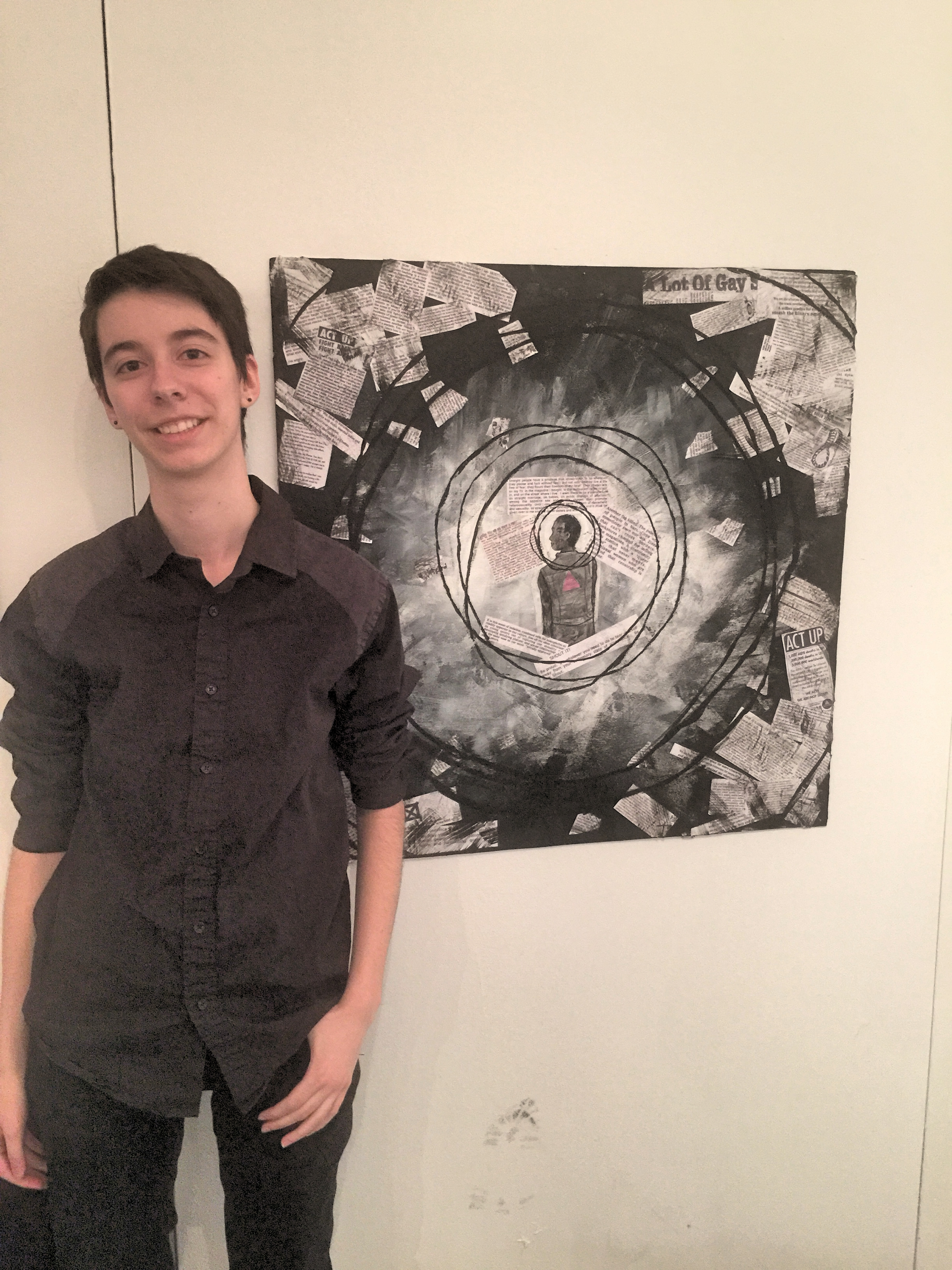
Eric with his response piece to Acconci in the "Talking Back" exhibition featured at KPU ahead of the trip to New York and Venice.
How did you approach the creative task of responding to this assigned work in studio? What were your challenges as an artist to be in dialogue with the artwork and artist? Would you do anything differently now that you have seen the work in person?
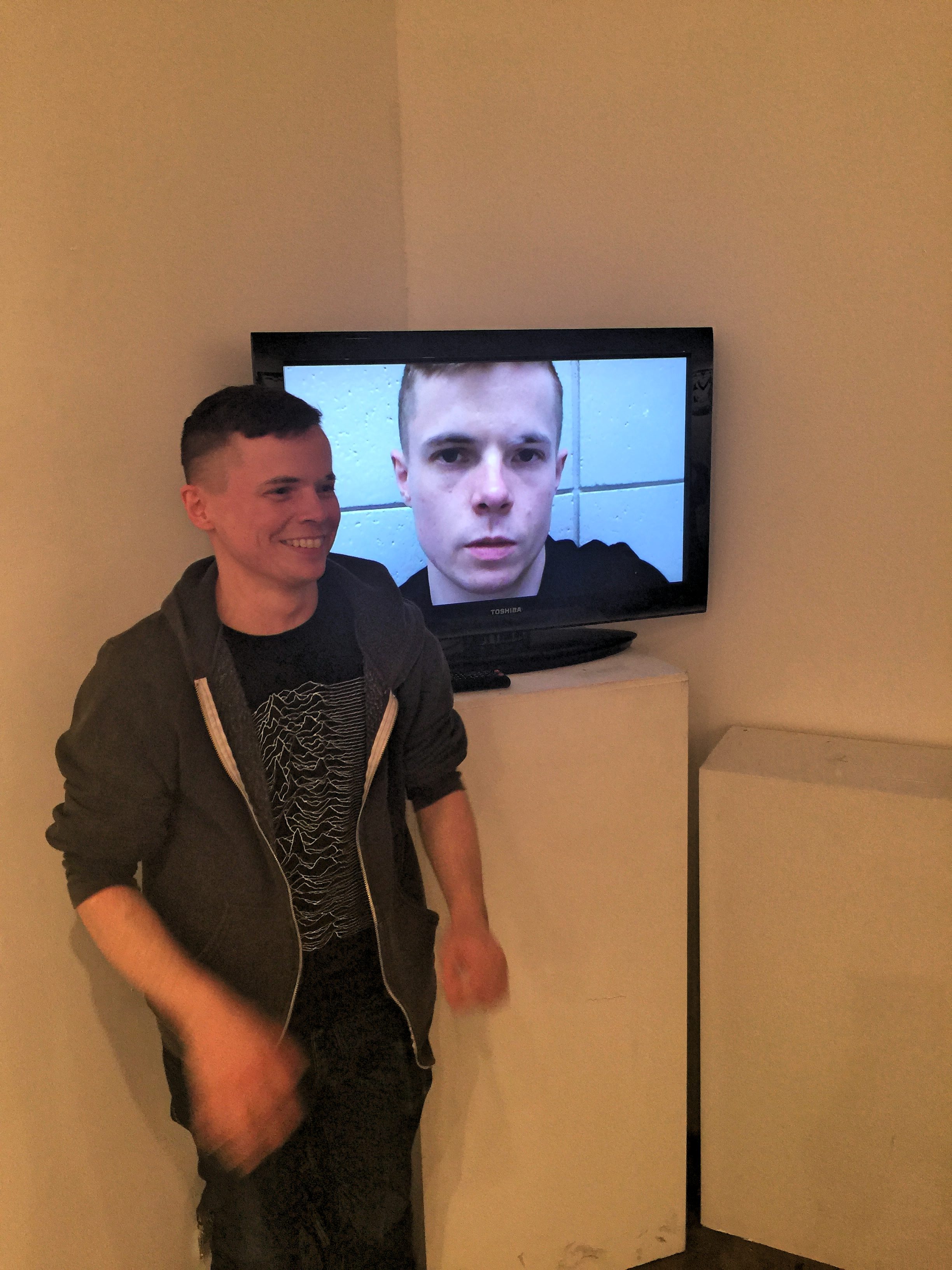
I felt that a response to Theme Song in a traditional medium like painting or sculpture, or even photography, would be difficult as well as regressive. I had not used performance or video for any of my assignments previously, but wanted to for this piece. Luckily Acconci’s bare bones simplicity — and the contemporary strategy of deliberately de-skilling — meant I didn’t have to worry about technical polish (which my video definitely didn’t have). I found Acconci’s needy requests and intimate rambling uncomfortable, and I didn’t want to merely ape him; instead, I found myself focused on the music he plays and thinking about the ways we identify with songs and potentially use them to communicate deep feelings to others. It made me anxious to be in a video, and I was unsure about what makes a video art; there was a big chance of producing a work that was a failure. Ultimately, I don’t think my piece was successful, but I am still excited to experiment with film and video in the future. After seeing his work in person (and getting over the anxiety of showing a video that features me), I think I would have a looser, more relaxed and humorous approach in my response. Maybe sing along to songs but change lyrics to play with the understandings and stories art creates? A piece that plays off of the voyeurism of watching someone just hanging out alone in their room?

Video art is not an easy art form to curate at an art gallery-- Eric found many limitations in the way Acconci was presented both at the MoMA and the Whitney Museums.
After seeing your assigned art work in person (and any other related art from the same artist or art movement associated with the assigned work), what struck you most, and/or how did the artwork’s form, content, and context shift for you when seeing it?
In the busy area in the MoMA in which the work was situated (essentially a thoroughfare from an entrance point to the elevators), a lot of the uncomfortable intimacy of the piece was lost. I could hear the ambient noise while wearing the headphones, and I felt far less singled out by his monologue than when I was watching it alone at home on my computer. It allowed me to appreciate the humour in the piece. What struck me most in seeing the video work on display at the MoMA was the awkward way in which it was displayed — it did not lend itself to people taking the time to view the full work. In the Whitney Museum as well, the video work would have required dedication to see in its entirety. Monitors were positioned in the middle of a regularly brightly lit gallery room surrounded by two dimensional work; viewers would have had to stand in front of their chosen monitor for the duration of pieces up to an hour long, and plug in their own headphones for clearer individual audio. Additionally, works by different artists were programmed on loop on a shared monitor. I realize the optimal display for videos possibly requires more space, but I wondered about the actual level of regard for these works. Are they there because they are now art history? Is there the sense that their messages have been absorbed (and are no longer important to experience first-hand)? The videos felt like the embarrassing stepchild of the museums.
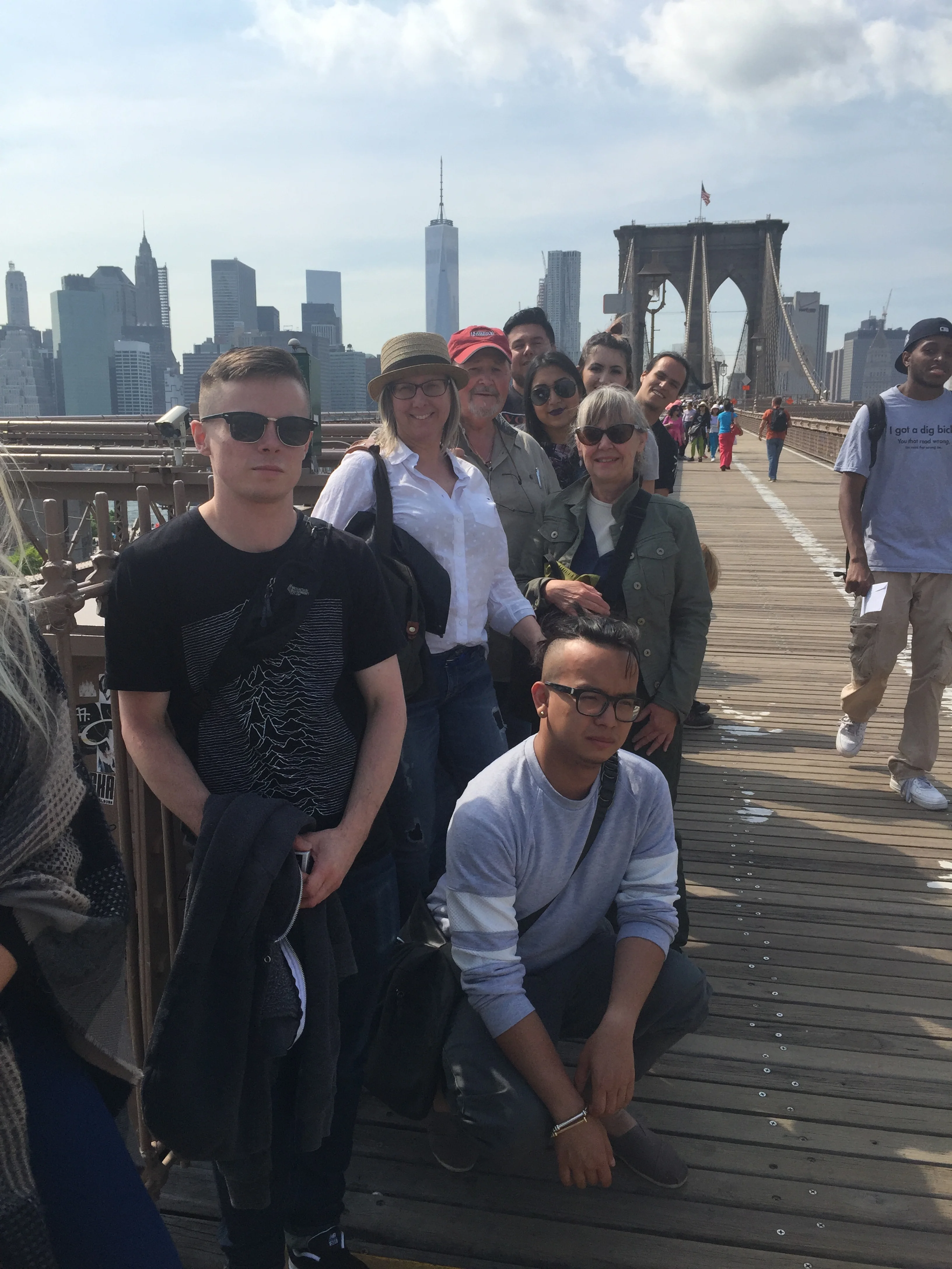
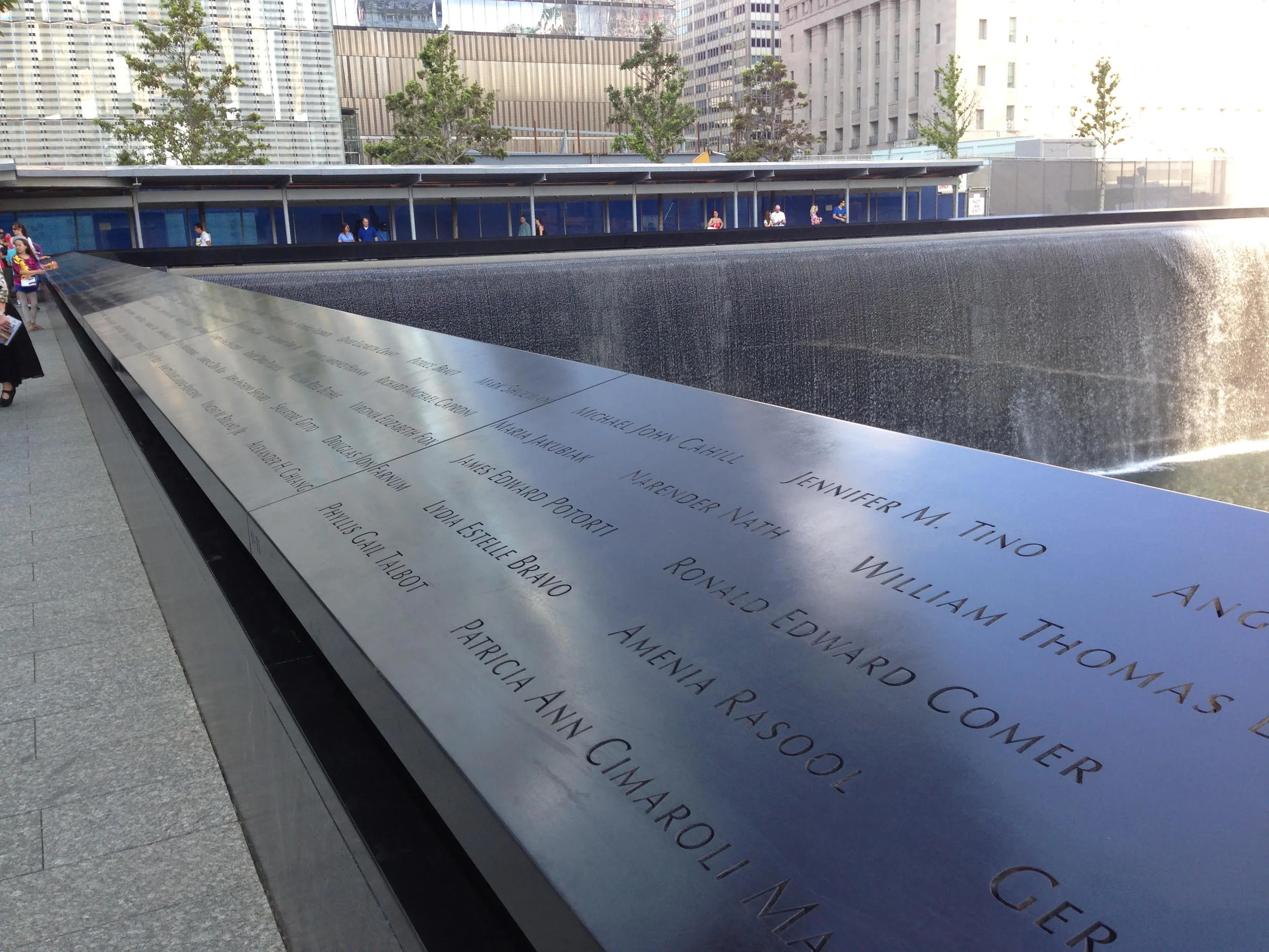
Walking the Brooklyn Bridge was a fantastic opportunity to take in another perspective of the Brooklyn and Manhattan skyline. Eric at the very front of the group.
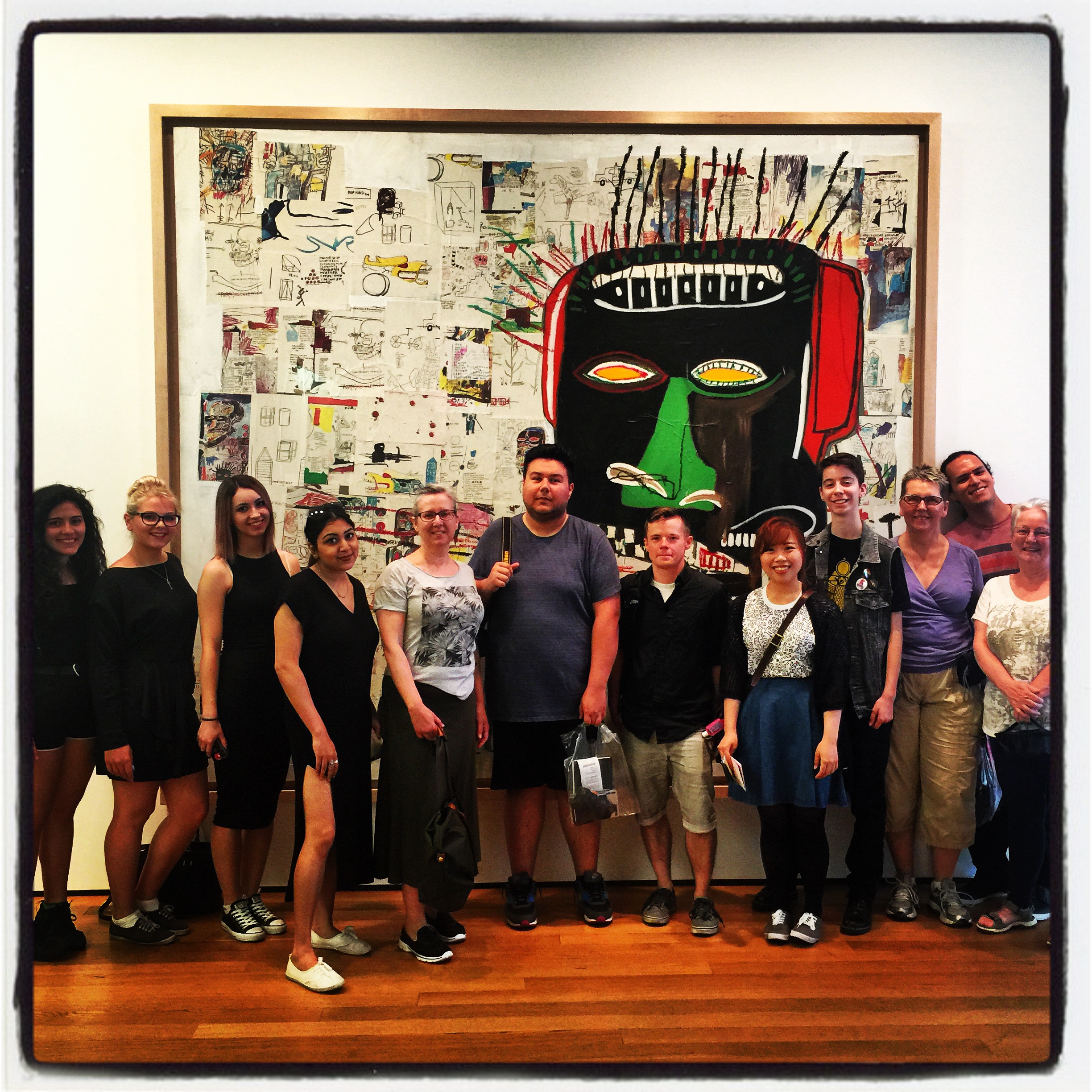
Today’s activity was at the Brooklyn Museum. What were your impressions of this part of New York after learning about it first in the pre-departure classes? What will you take away of the experiences of this day? What are the most memorable moments for you?
On my assigned day we went to the Brooklyn Museum, in Brooklyn of course. I think some of us were surprised that the museum was in such an old building, in architectural style if not also age. When I think of Brooklyn, or at least the western part of it, I imagine the now common pattern of gentrification: old factories and manufacturing buildings being taken over and repurposed; low and mid level rise residential, commercial and office buildings; rundown independent stores being remodeled into trendy businesses. Brooklyn has been reported to be a “hip” neighbourhood for years now (and has had previous iterations of being an artist hub, in residence if nothing else), and there are a lot of hipsters / indie kids / artists (or whatever you want to call them) in the neighbourhood.
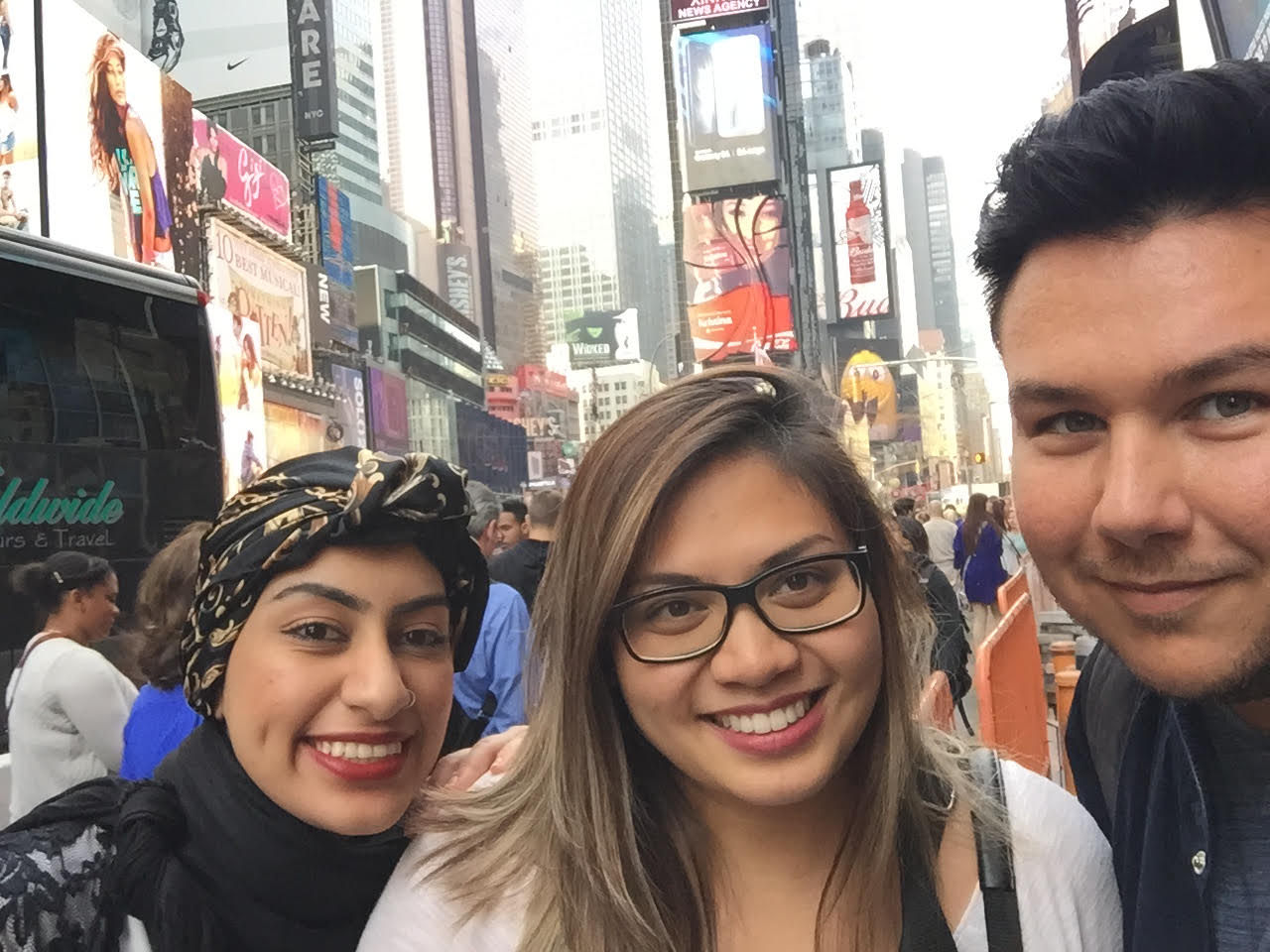
Our focus at the Brooklyn Museum was an exhibit of Jean Michel Basquiat’s notebooks. I wasn’t overly familiar with Basquiat’s work, but I connected with his interest in language, which I share. We then walked over the Brooklyn Bridge, and I got more great views of Manhattan and Brooklyn. I spent most of the rest of the day with one of our professors (Dorothy Barenscott) and two fellow students (Angela and James), walking around downtown New York neighbourhoods. We also stopped in at a craft beer bar (craft beer is one of my hobbies) and we shared in trying some tasty brews not available in Canada. Some art, walking on a beautiful day, a dynamic place, good company and conversation, good food and craft beer made for a great time. This entire day was a highlight of my trip so far.

Eric enjoying craft beers with Dorothy, James, and Anglea at One Mile House in Nolita, near Little Italy and SoHo.