

Tell us a little bit about yourself—your background, major program of study, reasons for taking this trip, and anything else interesting you want to share (maybe something people might not know about you).
I’m Jess Vieira, and I’m taking a degree in General Studies at Kwantlen Polytechnic University. Since I pretty much have no clue what I’m doing with my life, I figure I might as well try out as many courses and subjects that I can… though I’ve always had a soft spot for the fine arts. I really wanted to take this trip because I love discussing art and to be around other like-minded people in a place like New York discussing art comes with the territory. I’ve been on many trips around Europe, but these were all very tourist-driven, with lots of visits to ornate churches and tourist destinations (that’s what my parents like… and they were the ones bankrolling). The goal of this trip was to get out of that box, and actually experience the place that I’m in. I’m also planning an art project surrounding the street art of New York, so I’ve been documenting as much as I can. I love street art because by its very nature it is subversive, and much of it has even more subversive goals. My favorite type of art is that which talks about politics, and I strive to do the same in my work.
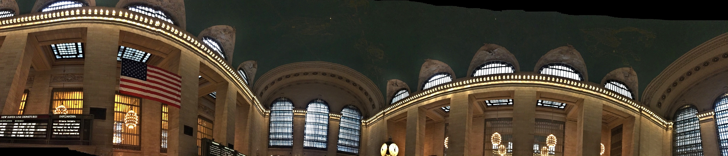
Grand Central Station was one of the stops and the focal points of architecture and design during the assigned day of Jess's blog post.
What has met or exceeded your expectations or surprised you about New York so far?
The thing that has surprised me the most is how much the city can change just by traveling for twenty minutes. You can go from huge modern city, to old fashioned European, to flat factory district in the blink of an eye. Some places I walked reminded me heavily of downtown Vancouver, while others started me reminiscing of Lisbon, and still others brought to mind Wiesbaden; places which I would never have associated together previously. Oddly, I found it hard to connect most of the city to my image of it (brought by the slew of movies I’ve seen that seem to be about it, and of course my readings for this class), and the place which I like the most is Brooklyn, where we happen to be staying. Brooklyn is of course, huge, and I’ve definitely not seen as much of it as I’d have liked, but still this place feels the most like the New York I pictured, despite trading huge skyscrapers for squat suburbia. Perhaps it’s the prevalence of street srt here; they seem to be doing a stand up job in Manhattan removing it, washing all my New York associations with it. Or maybe it’s just that I don’t pay very much attention to the geography while watching movies… though half that stuff’s filmed in Vancouver anyway.
Give us some insight into your assigned artwork from the Museum of Modern Art. Who is the artist? When was this work made? What is the content of this work? In what context and as part of what art movement was it made?

Jess was assigned Jasper Johns' Target With Four Faces (1954)he 9T
My work was Target with Four Faces (1954) by Jasper Johns. It’s a work of encaustic over various newspaper clippings from the time, creating a detailed and ornate red, blue and yellow target. Above this resides four plaster casts of the bottom half of a face, sitting in individual boxes that have a single hinged lid. The meaning of this work is much discussed, with Johns’ seeming purpose being the creation of an object rather than the representation of an object, and also of creating a piece that is set very specifically in a time and place (due to the newspaper). Other interpretations include that which says the target is a literal target placed on Johns himself due to his sexuality, while another argues that the lack of eyes on the faces juxtaposed with the target image is to do with the United State’s lack of knowledge/vision when making decisions. Johns belongs to the Neo-Dada movement, a precursor to the Pop Art (which is most associated with Warhol), and his work is generally that of common “objects” so as to add familiarity and link the audience with their own narrative. I first struggled with Johns, finding boredom in the banality of his work; however, after much research on the subject, and in fact seeing some of his works in person, I came to regard him as one of my favorite artists.
How did you approach the creative task of responding to this assigned work in studio? What were your challenges as an artist to be in dialogue with the artwork and artist? Would you do anything differently now that you have seen the work in person?
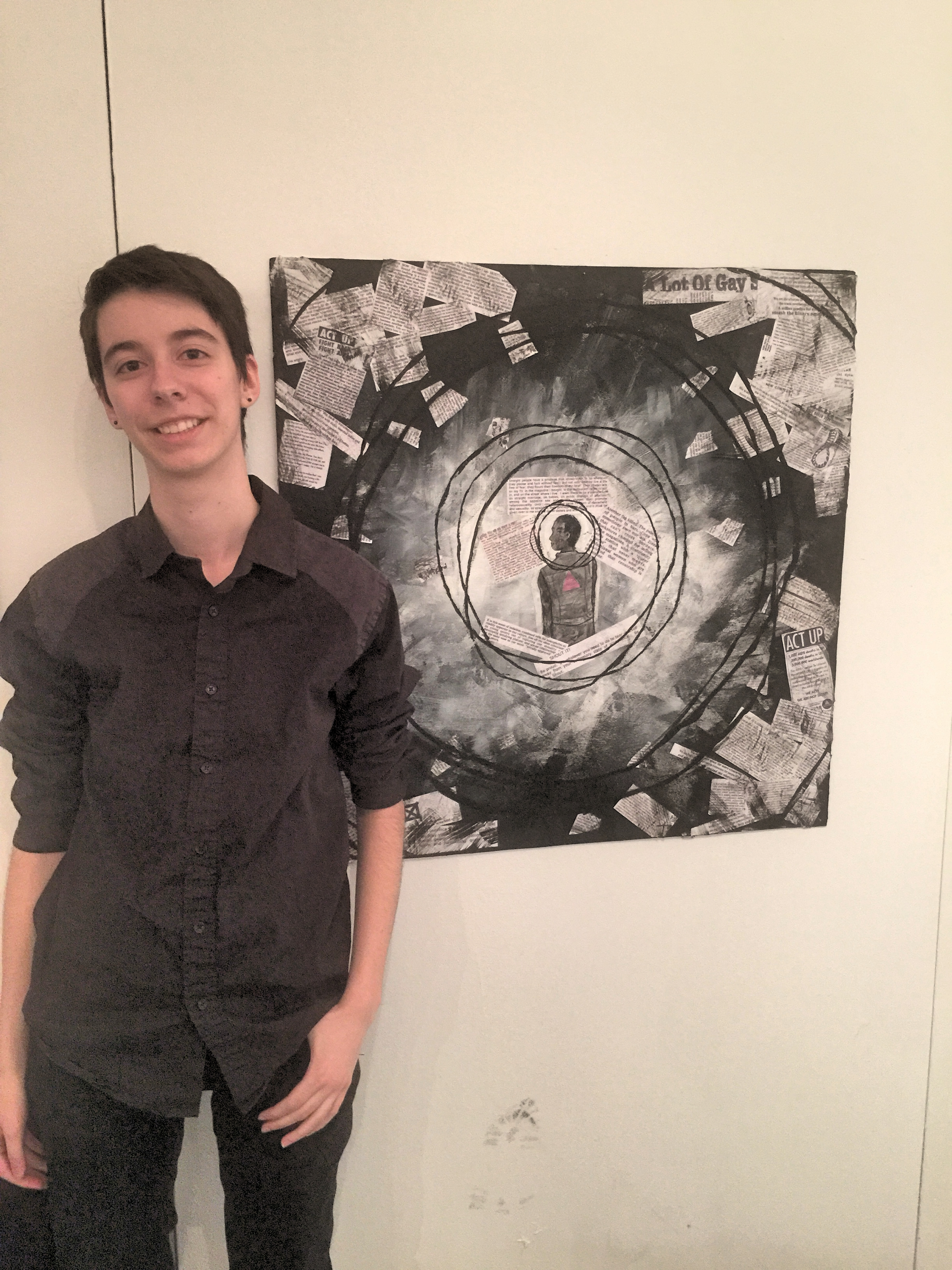
Jess standing in front of her response piece to Jasper Johns, part of the "Talking Back" exhibition at KPU ahead of the trip to New York and Venice.
I approached my work from an extremely queer perspective, since that part of Johns’ body of work was the most relatable and personal to me. Particularly the fact that Johns and Rauschenberg hid their relationship in order to be taken seriously, in relation to the simultaneous obscuring of queer culture in a general sense appealed to me as a subject, since it’s something not often addressed. I had some challenges in relating to Johns at first, without knowing much about him or his work, since I was not immediately attracted to it in an aesthetic sense. I feel that another challenge was the fact that while I did a fair job in finding dialogue in a very specific sense to the work, I didn’t cover it in a broader sense.

Jess looking at Maya Seuss's work during a studio visit in Brooklyn.
Because of the fact that my perception of the artwork didn’t change having seen in it in person, and also because of the fact that I was definitely not enraptured with Johns’ work at first glance, I doubt I would have done this project differently had I seen it a the MoMA first. Also, most of my inspiration for the piece was based on research, so simply seeing it in person would not have changed my approach.
After seeing your assigned art work in person (and any other related art from the same artist or art movement associated with the assigned work), what struck you most, and/or how did the artwork’s form, content, and context shift for you when seeing it?
The room containing Target with Four Faces 1954 is composed almost entirely of works by Jasper Johns and Rauschenberg. This target is mirrored by another, a green one, on the wall opposite, and on the same wall (broken by a door), is Rauschenberg’s Bed. It’s interesting, yet oddly appropriate, that they broke John’s flow by putting Rauschenberg here, as Johns’ flag is on another wall entirely. But since Rauschenberg’s and Johns’ works were so integrated, it does make sense. I wasn’t very surprised or affected seeing this piece in person in relation to seeing it online, since the pictures I had seen did a very good job conveying it. It was pretty much the size I pictured it as well, only a little bit smaller, but not by enough that it changed my perception. The only thing that translated better was the newspaper underneath, but I was more amazed by Johns’ Flag or some of his other, larger targets in this regard, since they were bigger and the newspaper was more evident.
Today’s activity was at the 9/11 Museum in the Downtown Financial District. What were your impressions of this part of New York after learning about it first in the pre-departure classes? What will you take away of the experiences of this day? What are the most memorable moments for you?
Of all the museums and galleries that I have visited on this trip, the 9/11 Memorial and Museum was the only one that I found to be highly problematic. To the degree to which I couldn’t retain some open vocal commentary while still within the museum, to which Dorothy responded “You’ve got to be quiet in this space or you’re going to get yourself beat up” (this feeling of threat, might I add, being part of this encompassing problem). The first feeling of off-ness would be the least of all the problems in my opinion, but still vaguely disturbing when you think about it. This would be the fact that there was rubble from the fallen buildings on display in the museum, set up and lit like art. Everything was aesthetically pleasing; twisted metal elegantly displayed like sculpture, bashed up concrete piled artistically… and all lit like an art gallery.
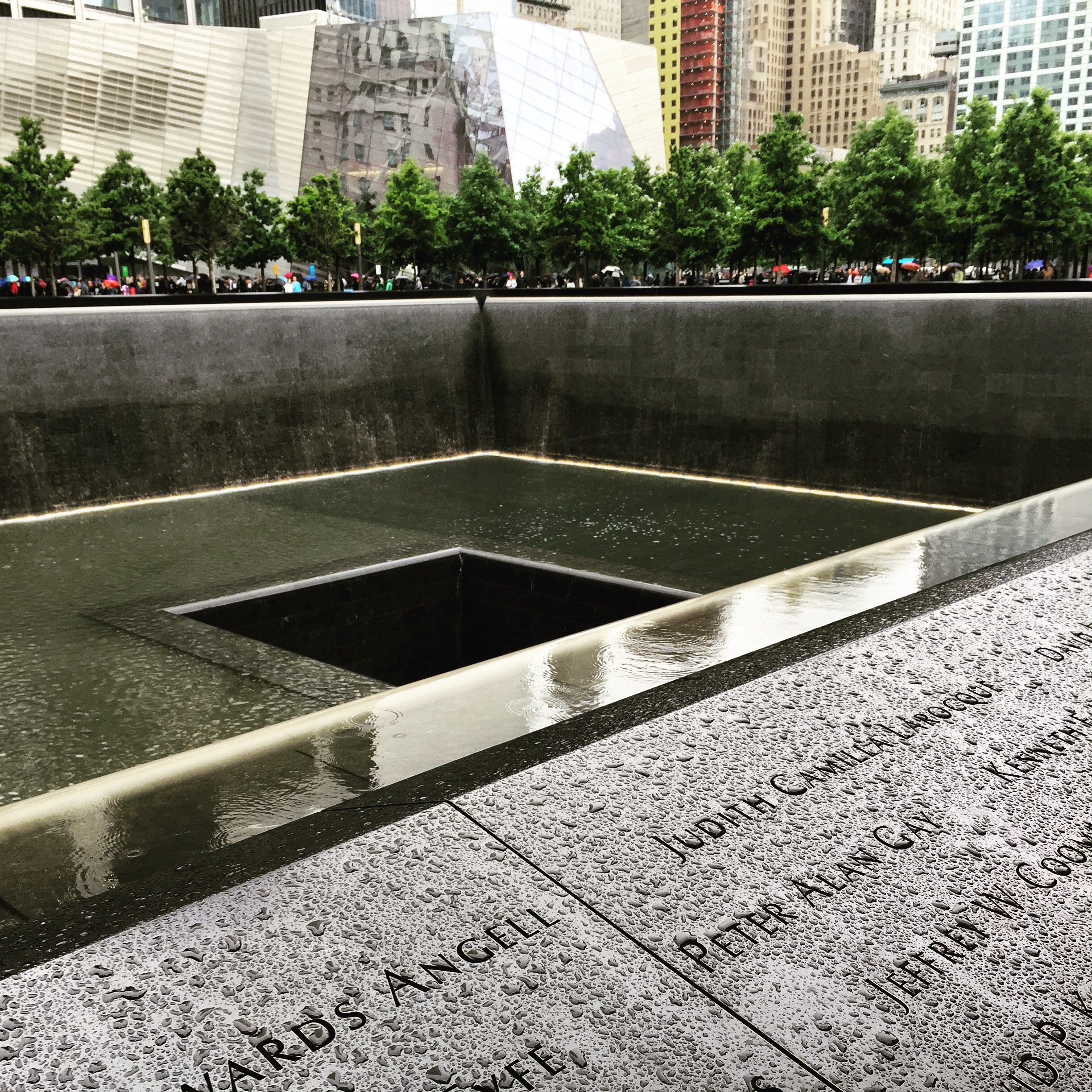
The 9/11 Memorial Museum is a very provocative memorial and continues to generate controversy and discussion.
The next thing was a little more glaring and a little less surprising, but not in the least unimportant. Patriotism. Now patriotism isn’t a bad thing per-say, but the way in which they had transformed this event into a rallying point is the same way they have transformed war into the supreme glory for the nation. In fact, there were some images of post-9/11 street art, with one featuring a soldier triumphantly planting an American flag into the rubble of the demolished buildings. Other street art images were equally as troubling, with most being extremely and blatantly patriotic, but some even worse, some subtly racist. The worst such offender I noticed was a messy red text on a dilapidated house reading “GOD FORGIVES BUT WE DON’T”. While it’s not saying anything overtly racist, the meaning is evident if you know anything at all about 9/11. Why was this picture even in the museum? Though with the extremely unnecessary exhibit on Osama Bin Laden, featuring many mugshots of unnamed Muslim people, I shouldn’t have been surprised.
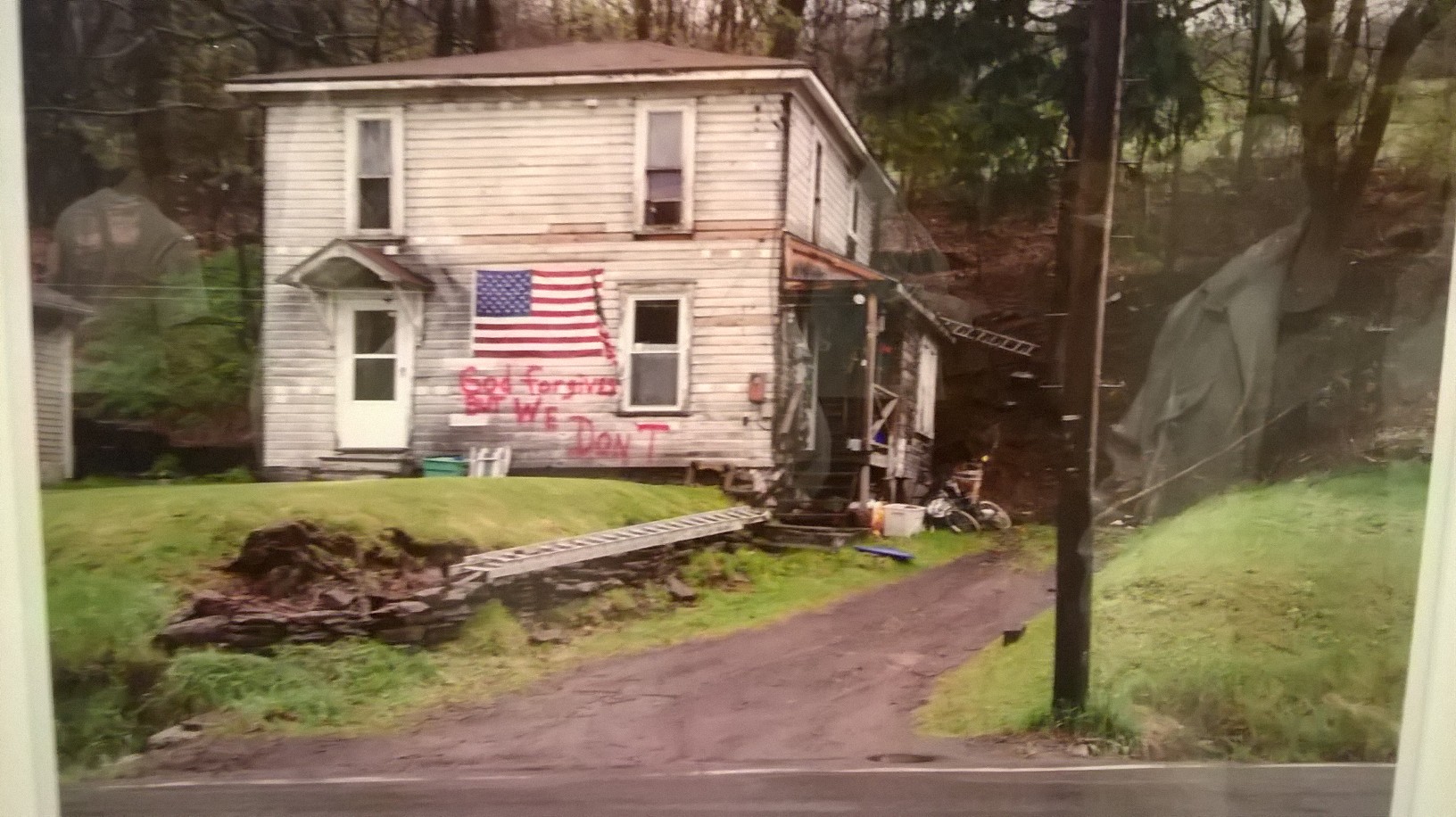
Jess captures one of the more provocative images seen at the 9/11 Memorial Museum.
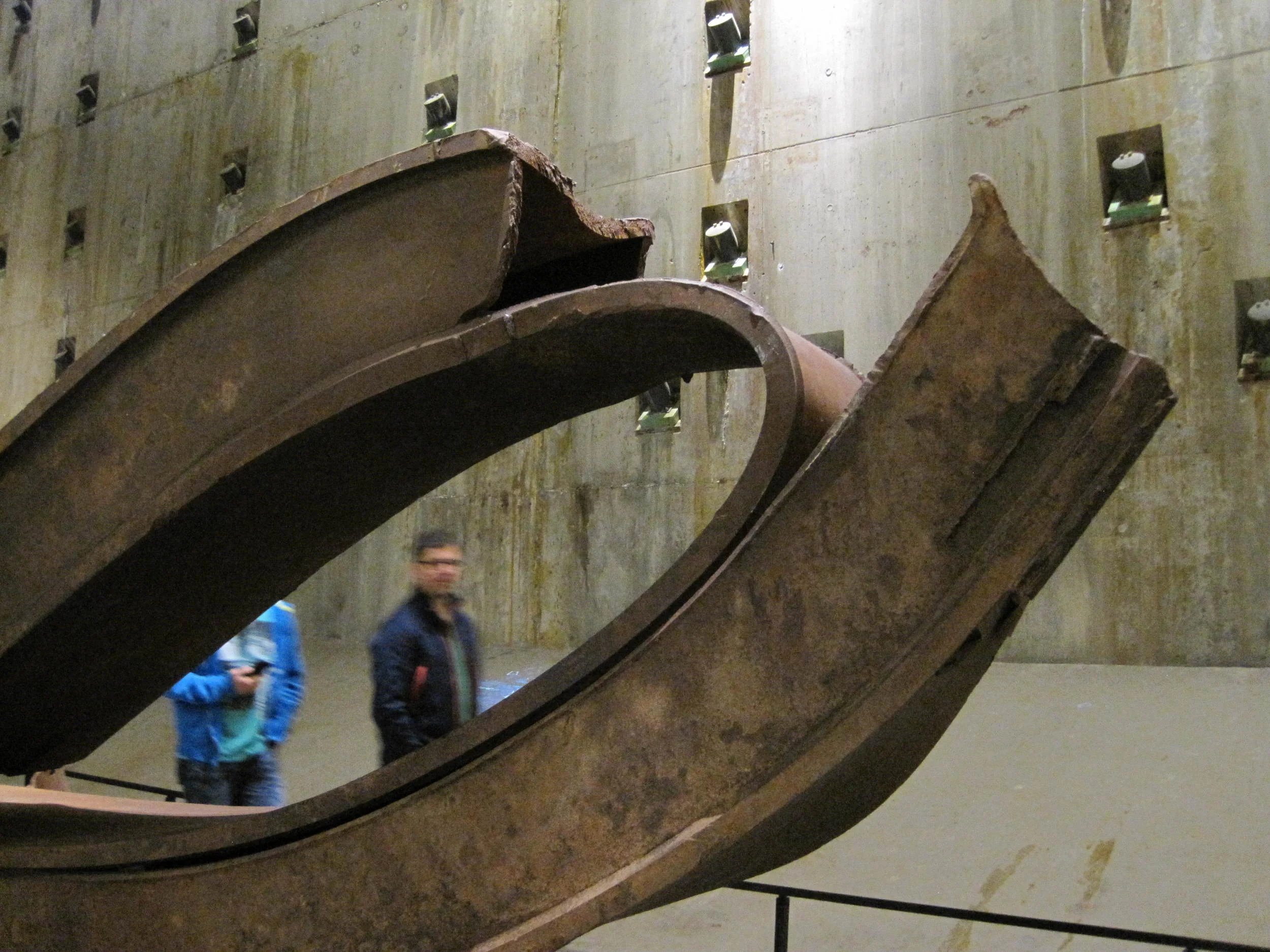
Jess's image reflects on how much of the 9/11 debris was lit and exhibited problematically as art objects.
In the same vein, even the only actually necessary part of the memorial (since yes, this museum was intended to be a memorial), this being a room with pictures of the deceased and short stories about them, was somewhat disconcerting. This was because, in looking around the room, it was evident what kinds of people America is mourning for… white, upper middle class, men. With 9/11 being considered the “worst tragedy in recent history” (or at least, this is the sense I received from research online) by most Americans, it makes you think about the type of people America cares for the most… As pointed out by Larry in reference to the plethora of photos of people looking at the sky in horror, “that’s what the civilians America’s bombing would look like”. But no one seems to care about them.
Other than that debacle, we also visited Grand Central Station, which had beautiful architecture, and disappointing bagels.