
What are we looking at? How do we judge? At the beginning of each semester, I start most of my art history and film studies classes with these two questions, along with a discussion about the fundamentals of performing a critical reading of visual and/or cinematic language. Over the years, the close reading of images based on the inventorying of FORM, CONTENT, and CONTEXT, has come to serve as a cornerstone of my teaching—in fact, the blog post describing these values in brief is one of the most visited posts on my website!—still, the ideas behind each of these categories is often confusing and takes time to distinguish and truly understand.
Over the next week as I begin to introduce these concepts in each of my classes, I will create a separate post detailing and describing each of the three core elements of form, content, and context—creating a kind of ready tool kit for looking and assessing art and film. I have decided to do this using the same three examples—Manet’s Olympia (1863), Dorothea Lange’s Migrant Mother (1936), and the classic Hollywood film The Wizard of Oz (1939)—in order to build a dynamic set of examples that create a more comprehensive whole.
As I tell my students, all of us come to look at art and film with a sense of our own aesthetic tastes—we can’t help it since we all have eyes and feel we can judge what we see—but it is in bringing awareness to how and why we evaluate and create those judgments that is core to the study of any art. Let us then begin with FORM.
FORM
Following Dr. Robert Belton’s descriptions in Elements of Art in an Online Handbook (thanks again to Dr. Bob, my first art history professor, for taking the time to produce this useful document), we can locate a useful and basic definition:
“Form means the constituent elements of a work of art independent of their meaning (e.g., the colour, composition, medium or size of a flag, rather than its emotional or national significance). Formal elements include primary features which are not a matter of semantic significance (i.e., which do not carry meaning the way a word does): these include colour, dimensions, line, mass, medium, scale, shape, space, texture, value, and their corollaries. The secondary features are the relations of the primary features with one another: these include balance, composition, contrast, dominance, harmony, movement, proportion, proximity, rhythm, similarity, unity, and variety.”
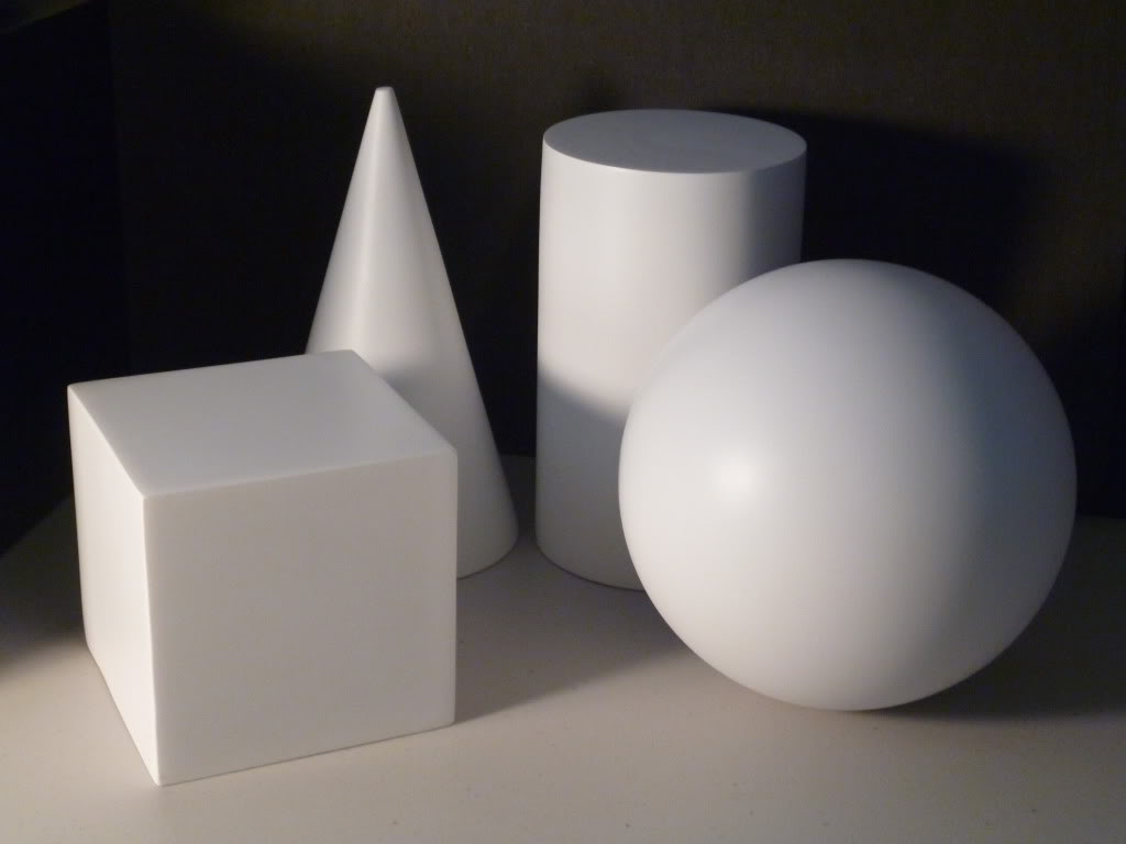
When looking at a visual object, the key to assessing form is to try and ignore all of the strong pulls towards the narrative and/or other identifying characteristics of the works historical and/or social connections, and to just focus in on materials, size/scale, and the question of how the object under examination was literally put together. For artists and for those who make or repair objects, form is perhaps the easiest element of art to assess. Their natural curiosity about how another practitioner produces an object forces them to look first and foremost at the working parts and the “how to” of the piece.
Let us look at our three examples:
Edouard Manet, Olympia (1863)
Edouard Manet, Olympia (1863)
The first item to inventory with any work is the medium. Here, we are looking at an oil painting. Now, please forget for a moment that you are also looking at what appears to be a naked woman staring out brazenly at the audience—we will get to that later in CONTENT—and note for a moment the following values:
Medium: Oil painting on canvas. This is important to distinguish since this kind of painting produces particular kinds of effects that differ from watercolour painting, or painting on wood, for example.
Size: 51.4 inches x 74.8 inches. Measurements signal little without a sense of what those numbers mean, so I like to say that this painting is smaller than life size, and I have also provided a silhouetted picture of a person looking at it to help you get a sense of scale. The picture is intimate enough to look at closely, but not so small that you need to really get close to what you are looking at. Consider how different the impact of this artwork would be for example if it were as small as a cameo worn around the neck or as large as a gigantic wall mural.
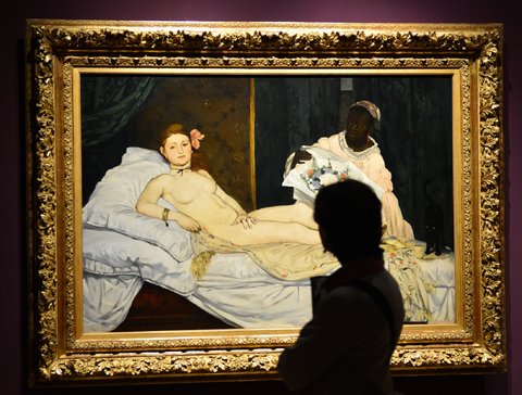
Getting a sense of a visual art object's scale is critical to assessing its form.
Colours and use of light: cool tones of red, greyed white, pink, green, and shades of brown/black with a subdued and limited palette. This is just a fancy way to talk about the obvious in what you see in the artist’s choice of colour. Noting the range of the colours used and how the light falls is also useful. Here, the light appears harsh, casting shadows and creating strong contrasts between areas of the picture.
We are at a disadvantage to assessing form when we cannot see the work up close, but with the use of tools such as Google Art Project, we can begin to appreciate materials and the production of art objects. See for example the dark contours around parts of the figure and note the many layers of paint building up the composition.
Composition: Figures appear flattened, without much depth, or an attempt to create perspective and deep dimension; there is contouring/outlining around some of the figures; there is sharp contrast between light and dark values in the painting; the painting also appears to be divided in two by the yellow line drawn through the middle of the painting. These are some of my preliminary observations about the balance, contrast, and general makeup of the composition, but note that I am only discussing how the forms are rendered, not about the actual "story" of what is being shown.
Dorothea Lange, Migrant Mother (1936)
Dorothea Lange, Migrant Mother (1936)
As with the previous work, I am going to ask you to ignore the obvious image of a woman with her children and ask you to notice that the medium we are examining here is a photograph.
Medium: Black and white analog photograph. Again, this is important since the quality of an analog image is different from a digital and/or colour photograph. The limitations of that media form are also important to consider.
Size: original negatives are 4 x 5 inches, but it is worth noting here that the size can range depending on how the image was reproduced (as photographs in a magazine layout, and/or print to fit in other newspapers and media). In other words, the size is variable and can be viewed at many different scales.
Assessing scale is not always an easy task with photographs, especially when the original prints have been shared and distributed widely, as is the case with this image.
The rule of thirds appears to apply in this image. In other words, It appears highly composed.
Colour and use of light: since black and white photography is being used, light is even more important. It appears by the lack of sharp contrasts that natural lighting is used to create this photo, and the tones and values are lighter in the bottom part of the image in contrast to the top half.
Composition: the image appears very carefully composed and adheres to the “rule of thirds" where an artist divides their image into thirds horizontally and vertically and makes sure to center points of interest on one or more of the intersections of these lines. It is enough to say here that there is obvious care in how the image is put together—it is not a snapshot photograph-- and this attempt to impose some aesthetic qualities to the image puts its documentary qualities as a photo into some tension.
The Wizard of Oz, dir. Victor Fleming (1939)
The Wizard of Oz, dir. Victor Fleming (1939) original movie poster.
In our final example, we will consider a work of film, a motion picture. Just as with traditional art, the inventory of FORM is concerned with the mechanics of how the movie is put together. Because films, by their nature as a moving media form, cannot and really should not be read via individual shots or freeze frames alone, we must consider the total system that the viewer perceives in the film. In other words, film form is the overall system of relations that we can perceive among the elements in the whole film.
Medium: Black and white and Technicolor motion picture
Size: 35 mm film with a 102 minute running time. Notice here that size and scale is considered differently for a work of film than other traditional art forms. The way we were originally meant to see the film by the director is also important to inventory.
Colour and use of light: With this film, we have a combination of black and white (sepia tones) and Technicolor for the majority of the film’s length. Most of the shots in the colour sequences are highly saturated with low contrast and shadows, while the black and white sequences follow almost a film-noir exaggeration of light and dark combined with use of shadows.
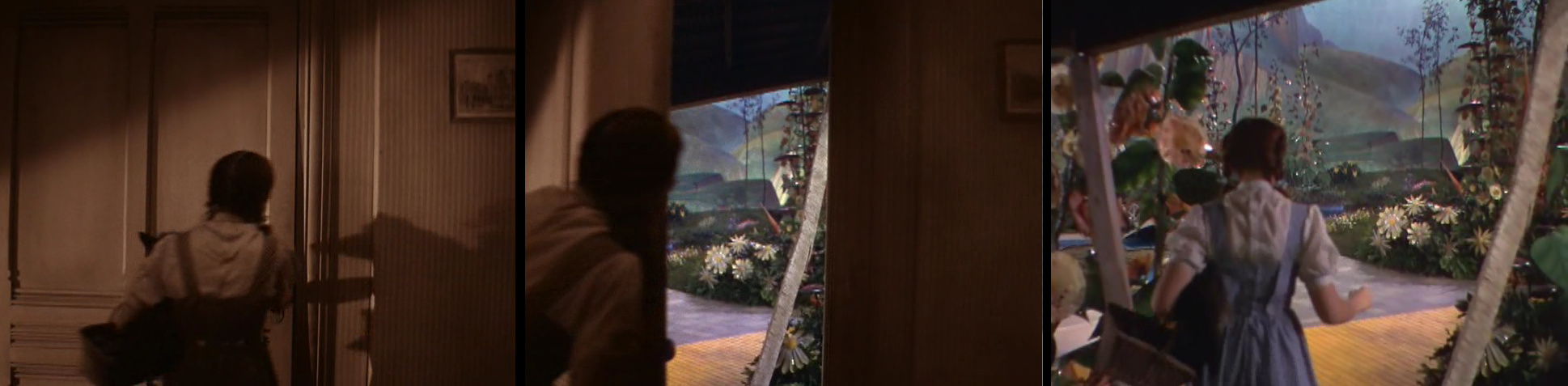
Transitions from black and white sepia tones to Technicolor occur at both the start and end of the film.
Composition: This is where things get a little different with the formal analysis of film. We can talk here about assessing the cinematic language being used and how the work is put together, but with film many additional elements can be considered. We can focus here on technical elements of cinematography, editing, sound, and overall design, which have been assembled to make the film. I will make a few observations here. First, continuity editing is used to shoot and sequence this film in order to create and ensure a smooth and continuous flow across and between various perspectives offered through the film’s storytelling. More technically, the film uses the 180 degree rule of editing. Music is also strategically used to draw attention to the main action of the film, and the overall pattern of the movie produces harmonies and pleasurable experiences in colour and sound throughout (with the small and notable exception of the opening and closing sequence of the film).

The overall pattern and feel of the cinematic language, including the sound design, is harmonious and pleasurable to the senses.
Stay tuned for the next two posts where I tackle the element of CONTENT and the element of CONTEXT using the same three works discussed above.