Tell us a little bit about yourself—your background, major program of study, reasons for taking this trip, and anything else interesting you want to share (maybe something people might not know about you).
My name is Adam Plottel, and I’m in my third (and a half) year into my fine arts program. Two years ago, I graduated from Langara College with a Diploma of Fine Arts, but I’ve always wanted to further my art practice, and so after a year off I came to KPU. Until recently I hadn’t been exploring anything specific in my practice, but that changed this spring when I first started to experiment with site-specific art as part of special-topics course about landscape art. As I’ve gone through my third year, I’ve found myself having a bit of an identity crisis when it comes to my art. Coming into the program part way through, I felt a disconnect between my art and everyone else’s, and my tendency to compare myself to others didn’t help my self-esteem. But when I first found out about the field school, I felt it in my gut that this is what I needed to reinvigorate my drive and absorb some fresh ideas to use in my practice. Even just going through the classes leading up to this trip has really been eye-opening, and helped give me the courage to fully embrace my foray into a new kind of art practice.
What has met or exceeded your expectations or surprised you about London (or Venice) so far?
Well considering how new this experience is for me I’d say EVERYTHING is surprising. I’m absolutely falling in love with this city. When I walk down the street, I can feel the energy of the city pulsing out of the numerous pubs and cafes that line the old cobblestone roads, and in the people that pass me by. London seamlessly combines elements of new with the old. You can see the skyscrapers from behind the preserved brick buildings, and the museums we’ve been to have been a mix of avant-garde design contrasted with the gothic architecture of the surroundings. What I found really comforting is how similar the weather is to Vancouver. It’s nice to have a respite from the heat in the rain, even if I don’t always dress appropriately for it. But I’ve learned my lesson, and I can say never choose fashion over function in London folks! Every day we’ve been here has been fully packed with activities and outings and yet I still feel like I’ve barely experienced this city and all it has to offer. I almost don’t want to leave for Venice!
Adam, pictured on the left side of the photograph seating and leaning forward, is a fine arts student in the final year of his BFA program at KPU.
Give us some insight into your assigned artwork from the Tate Modern. After seeing the work in person in London (and any other related art from the same artist or art movement associated with the assigned work), what struck you most about it and/or how did the artwork’s form, content, and context shift for you when seeing it.
I think my assigned artist was really a perfect conduit to explore some complex ideas and force me out of my slump so to speak. Protect Protect by Jenny Holzer (2017) is from a series of hers where she paints over declassified documents from the Iraq Invasion and the war on terror. Holzer herself usually works with language as a medium and has worked with light projections and site-specific works. She herself admits in her interview with Kiki Smith for Interview magazine that she is a “bad painter”, so it’s interesting how she’s attempting to reconcile it with these washes on top of her military maps. For the record, the language she uses in her work is generally not her own, separating her artist persona from the work in order to not distract from the conversation she hopes is sparked by her art. Seeing as how the specific piece I was assigned is a print, it wasn’t much different seeing it in person than on a screen, although the size of it was a bit surprising. However, seeing it next to another in its series added some context. Having the ability to see how the U.S. military has chosen their language in these maps and what has and hasn’t been declassified really highlights current and past attitudes towards the whole Iraq war. The paintings provide a cold reading of the aggression towards Iraq through words such as “shock and awe”, “seize”, “isolate” and “exploit”. Holzer intended for this series to inspire conversation removed from the sensational war images that dominated news coverage of the time, so that people could really grapple with the implications of America’s role in this major event. Ironically, I feel like hanging these in a contemporary art gallery kind of robs them of their ability to spark conversation, at least in the literal sense, since you don’t generally discuss deep, multi-faceted political issues in an art gallery. Or maybe that’s just me. I tend to keep those conversations in places where I don’t have to worry about disturbing others since they tend to get a bit shouty. The two “paintings” are in their own room as part of a larger collection of Holzer’s work, which includes some of her LED pieces, that were flashing through the doorway onto the wall. I wouldn’t say that aided or diminished my reading of the piece, but it’s something I kept noticing as I was initially taking it in.
How did you approach the creative task of responding to your assigned artists in studio? What were your challenges as an artist to be in dialogue with the artwork and artist? Would you do anything differently now that you have seen the work in person?
Adam seeing one of his assigned art works, Maggie Hambling’s 2016 (2016), at Tate Britain for the first time.
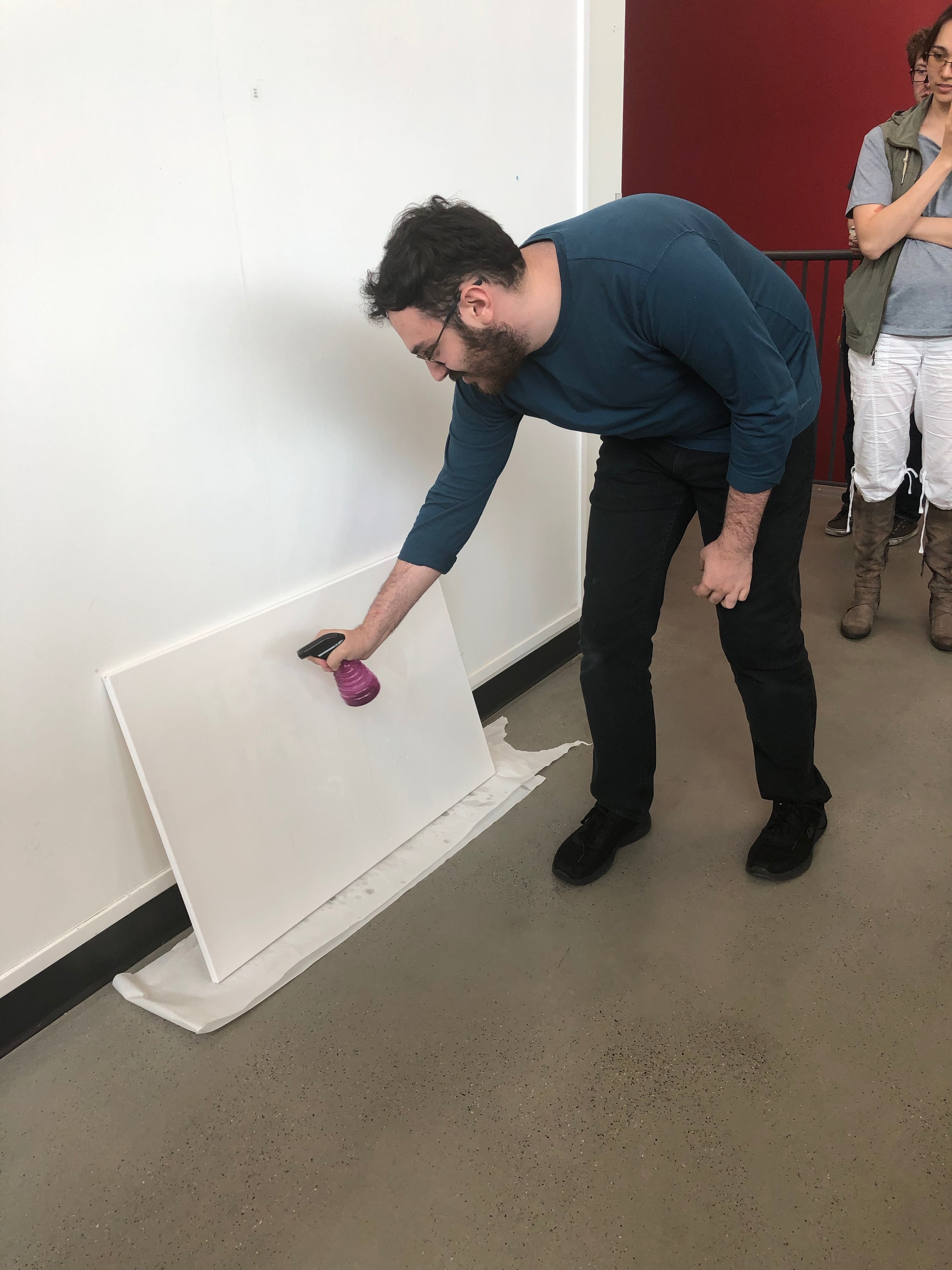
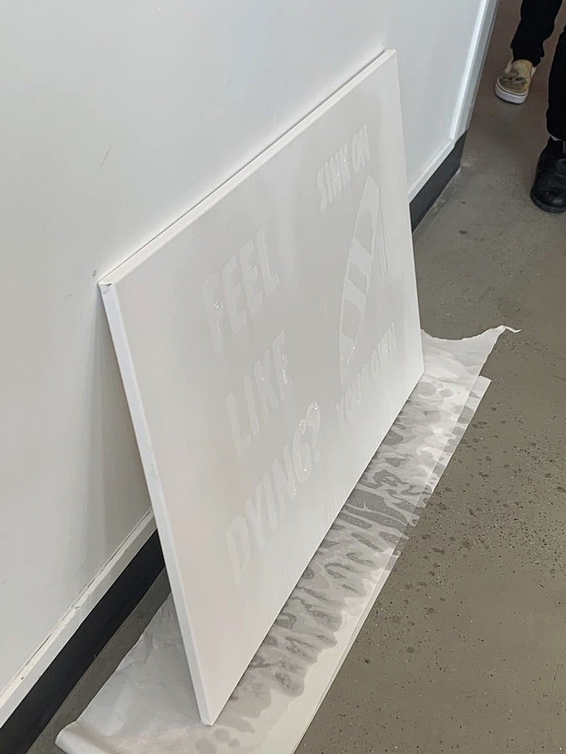
Given that neither Dorothy nor Elizabeth had had me as a student before, their initial assignment for me was something that utterly confused me. Thankfully I got the opportunity to switch up my first assigned artist and ended up with 2016 (2016) by Maggi Hambling. 2016 is an oil painting depicting a boat sinking beneath the turbulent waves of the sea. Hambling painted it in response to images she saw of refugees drowning in the Mediterranean Sea trying to escape to freedom. Since we were working in a short amount of time, and I knew I didn’t have the talent (or energy) to make something of that magnitude, I decided to revisit an idea I had played with in my landscape class from the previous semester. I worked with something called hydrophobic spray, which is generally used to waterproof shoes and tents and such, but as it turns out is also really good for making waterproof art! Who knew? My original intention was to create a stencil and apply it to the pavement outside, so that the piece would react to the rain and only appear at certain times, but facilities had some “objections”. In my desperation I bought a canvas right before class and sprayed it on. While Hambling doesn’t really deal with the ephemeral in her piece, she does draw inspiration from her own outrage at social issues, so I decided to roll with that. “Feel like dying? Sink on your own” was my way of articulating my frustration with the world’s lack of meaningful response to climate change, and how despite overwhelming evidence, people still have the gall to say things like “but it snowed this year”, or “even if it’s true it won’t affect me since I’ll be dead by then anyway”. The boat was my attempt to maintain at least a superficial relation with Hambling’s original piece. As I sprayed the canvas with water, the words appeared, and as it dried so did the words disappear (see images of art work and performance below).
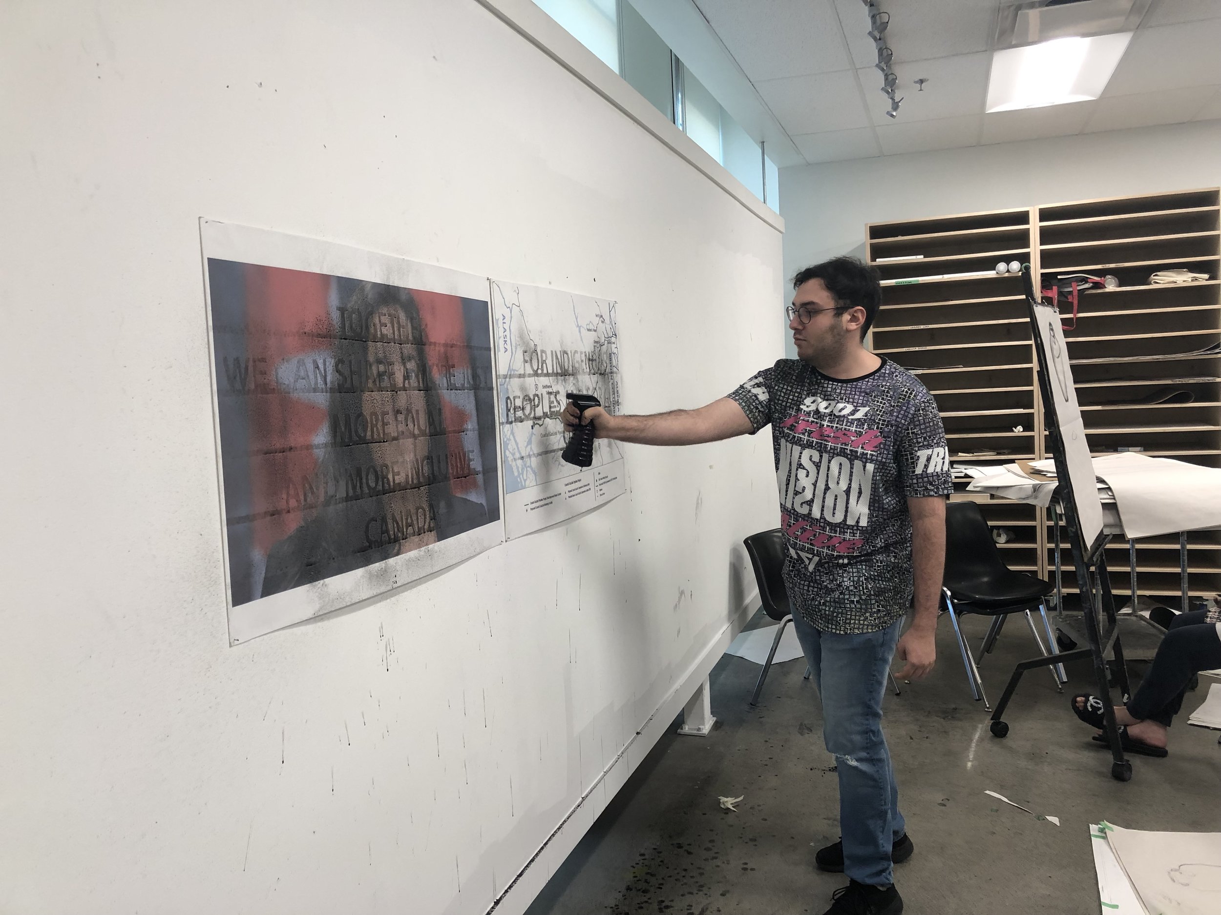
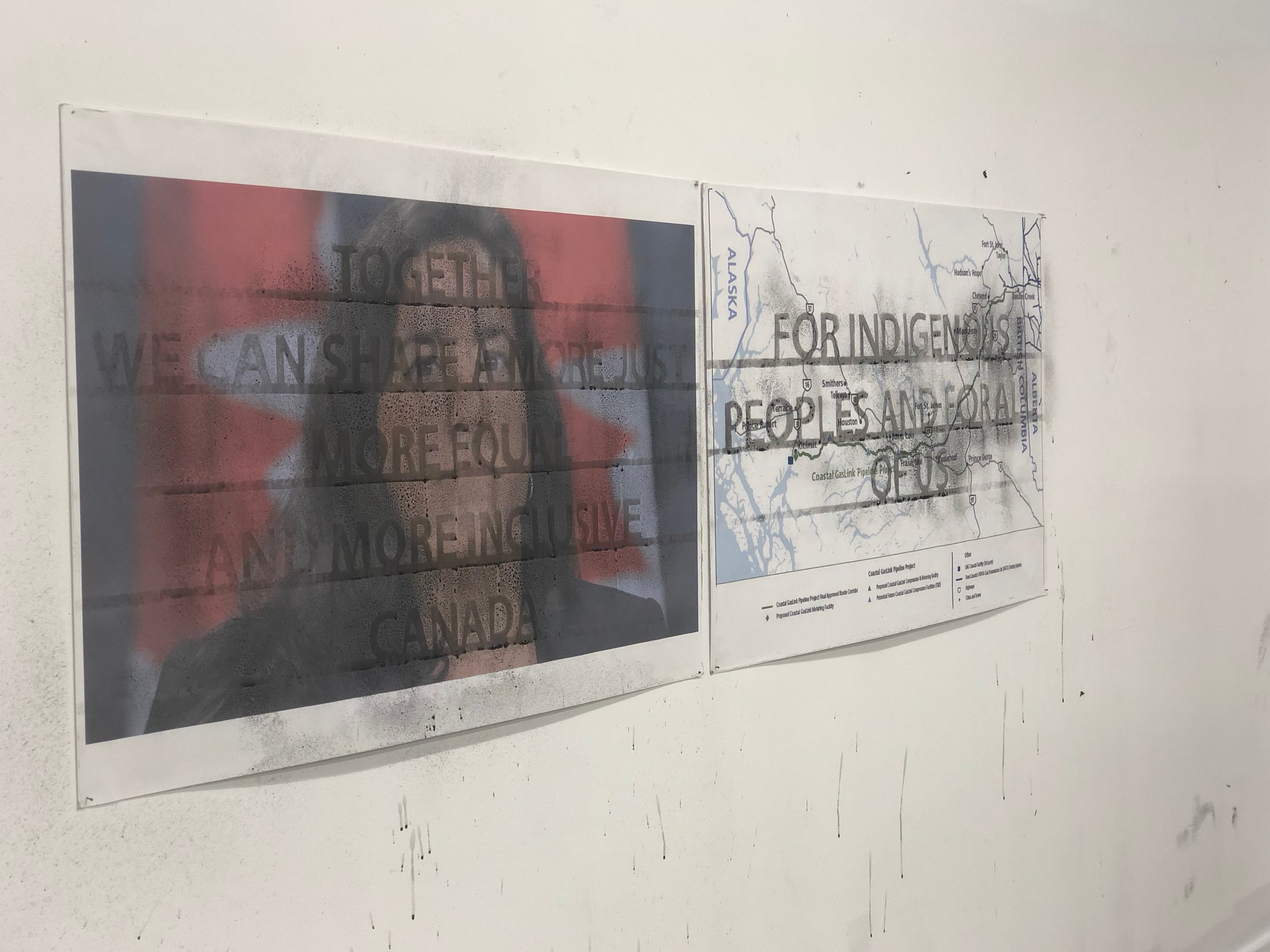
For my second piece, I was able to further work with language as it was relevant to Holzer’s practice. In my endeavor to emulate her use of government documents, I chose to use something related to the Canadian government. I think I was still channeling my rage from my previous project as I chose to focus on our government's lackluster attempts at reconciliation with Indigenous peoples. This time, I wanted to do something a little more permanent, while still working with the performance aspect that my hydrophobic spray allowed (see images of art work and performance below) . On the left is an image of Jody Wilson-Raybould, who this year was removed from her role as Minister of Justice for her stance on indigenous reconciliation. The right image is a map taken from the website of the Coastal Gaslink pipeline, which the RCMP enforced an injunction against the wet’suwet’en band in order to put it through. My idea was to spray ink-tinged water to reveal a quote from Justin Trudeau’s speech on reconciliation from a year ago, the ink staining the words on top of these images, forcing the audience to acknowledge the permanence of these conflicting actions and statements, and how they’ll always colour any future efforts to reconcile with indigenous peoples. That these words won’t fade with time, and we will have to make great strides in the future to move past them so that they don’t define our relationship with each other.
Today’s activity was located at Shoreditch and included a street art tour. What were your impressions? What will you take away of the experiences of this day? What are the most memorable moments for you?
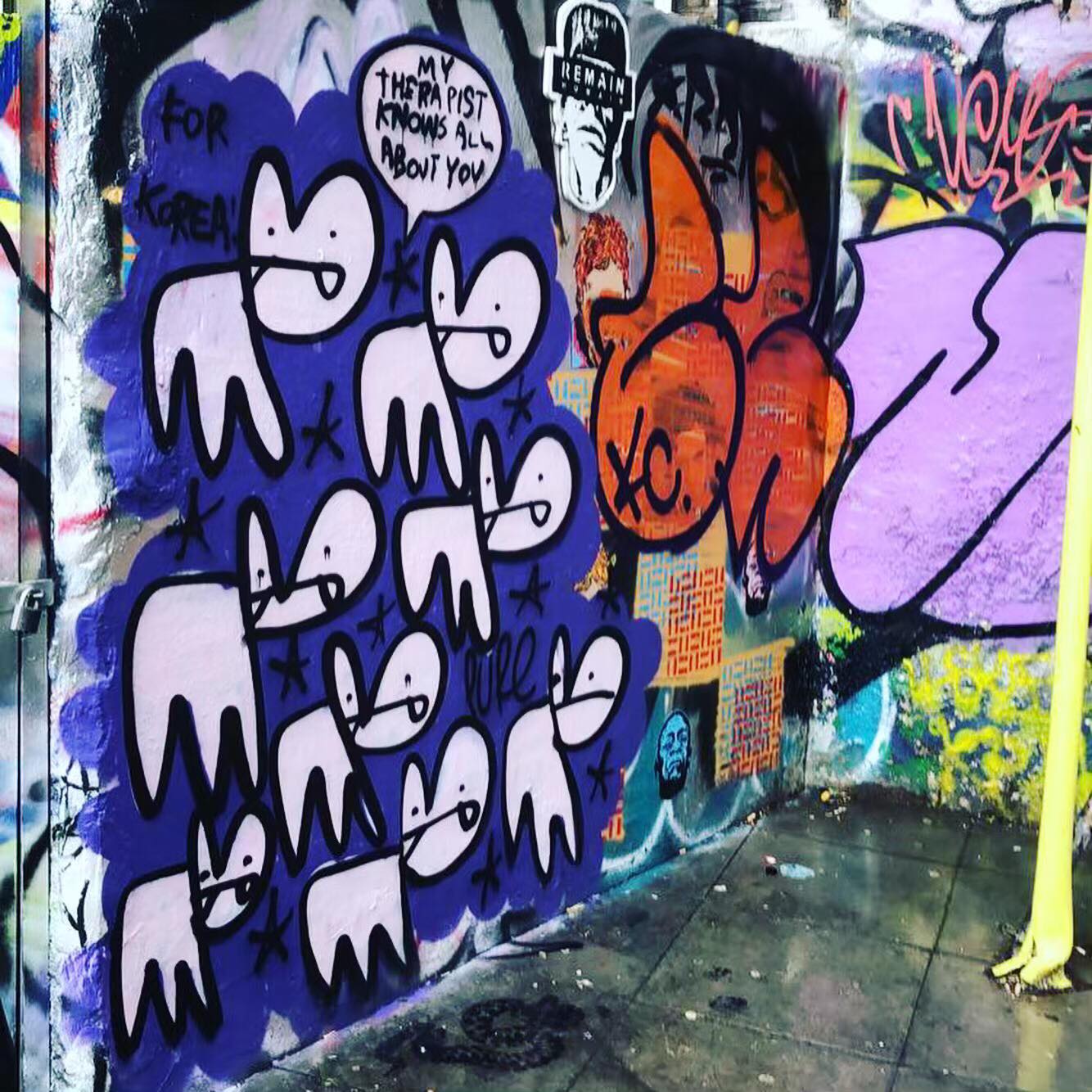
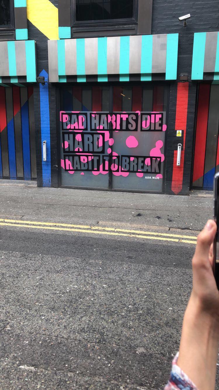
I was really prepared for our excursion today, since I had been on the Bristol street art tour on Sunday. What I liked about our guide, Dave Stuart from London Shoreditch Street Art Tours, was how he described street art and graffiti culture, and how the various artists we looked at influenced the scene in London. Our first stop was at the Splice Post Building to see the work of Camille Walala, who had painted the exterior in bright colours, turning the windows into film reels. Also, on that building we saw a commissioned piece by Aida Wilde, who was poking fun at her spot’s use as a smoking corner. Dave talked about the different spaces graffiti and street art operate in, especially who they are meant for. Graffiti, he explained, was made by graffiti artists, for other graffiti artists. We are not the intended audience, as graffiti is mostly a way for people to mark territory and show off their skills to others in the field as a tagger. We got to see a tag commemorating the loss of three young graffiti artists who lost their lives doing a dangerous tag on a raised train track. It’s a general rule that art honouring someone’s death should never be painted over or removed to show respect, and graffiti artists closely follow that code. Street art, however, is art made by anyone, for everyone. It’s meant to interact with the community in a way that graffiti doesn’t, such as the huge Northern Ireland Civil Rights mural by Anne McCloy. Further on we got to see a work by Phlegm, who I’d also seen in Bristol.
Group photo while on the Shoreditch street art tour. Adam can be seen peeking above us all as the very tallest student at the top right of the image.
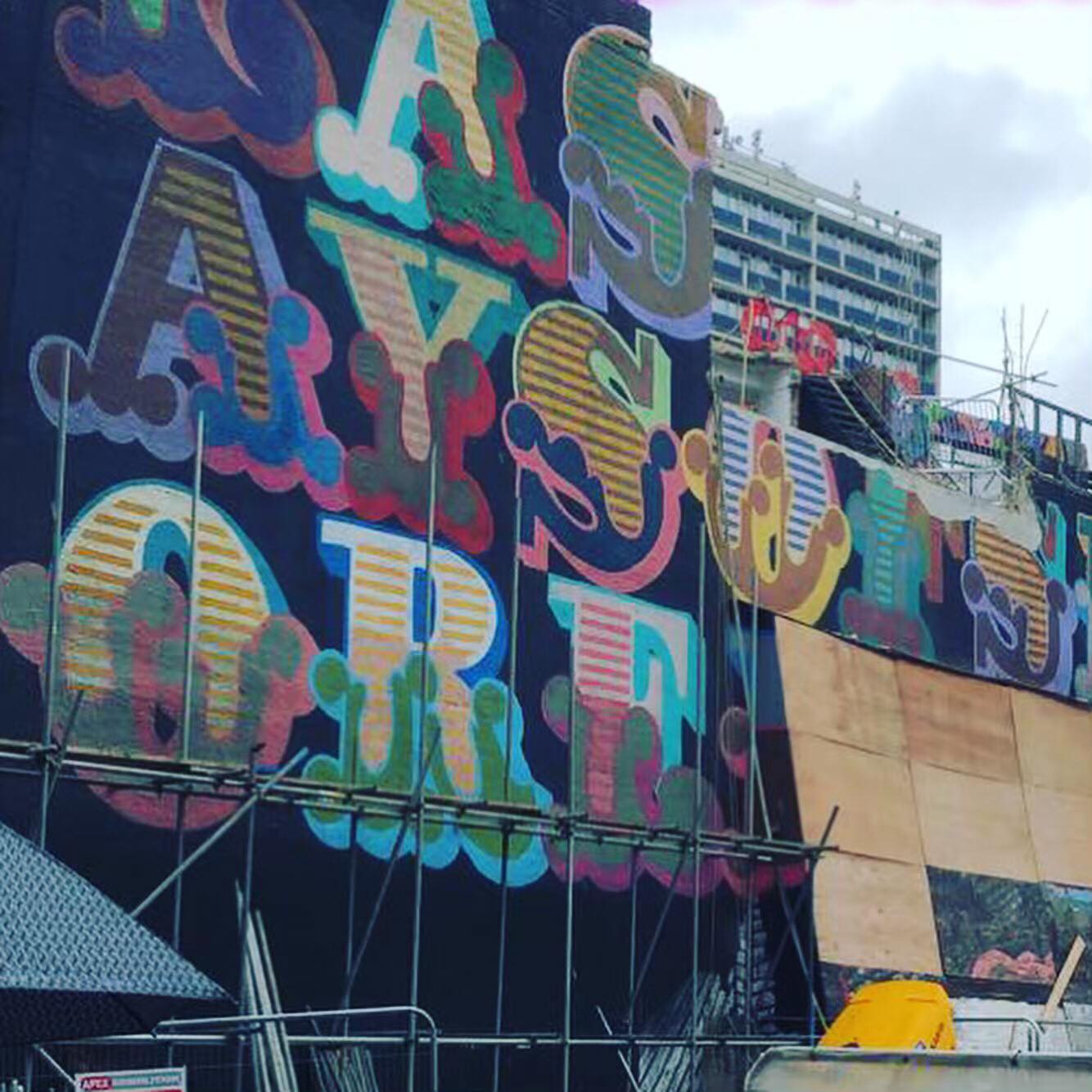
We then got to see LAST DAYS OF SHOREDITCH by Ben Eine, albeit in a partially destroyed form, as the building it was on is being torn down. The piece itself was a commentary on the gentrification of the neighbourhood of Shoreditch, lamenting the limited time left to the original residents as they were displaced by larger companies and land owners. Dave pointed out how this piece was being destroyed, but the Banksy underneath it was unanimously chosen for preservation. Ironic given how Eine’s work was given as a gift from David Cameron to Barack Obama during a state visit years ago. Eine is one of a couple living artists to currently have work displayed at the White House, yet his work was being destroyed in favour of Banksy’s work. We got to see the extinction symbol made of pennies, and Dave challenged us to recreate it at home with our own coins. We also got to see some of Ben Wilson’s chewing gum art. Honestly there was so much to cover in this tour that I can’t even begin to describe them all, but these ones particularly stood out. I can’t believe I’m in London learning about street art. Maybe I’ll have to leave my mark somewhere around here too, if Dorothy doesn’t stop egging me on!